Workspace ONE Intelligence is the core data platform for Anywhere Workspace solutions. By aggregating, correlating, and analyzing data from multiple sources and delivering actionable insights, Workspace ONE Intelligence enables our customers to make data-driven decisions. Due to the growing adoption of Workspace ONE Intelligence across our customer base, we have been investing in additional functionality to help our customers solve for other, more complex use cases. We’re excited to share some recent enhancements we’ve made to the user interface of custom widgets. These enhancements focus on delivering a more intuitive and efficient user experience for data exploration. In this blog, we’ll provide a detailed overview of the new functionalities.
1. New category selector menu
The first step to create a widget (from Custom Dashboards) is to select a data source or integration and the corresponding entity from your category selector menu. We’ve made design changes to this page and added a preview area at the beginning of the flow. This will result in a smooth transition to the query builder. In addition to this, we’ve added the option for pre-defined templates to the creation flow itself. You can access these templates through “Explore Templates” and use them as your guide.

Previous design for category selector menu

New design for category selector menu
2. Query builder improvements
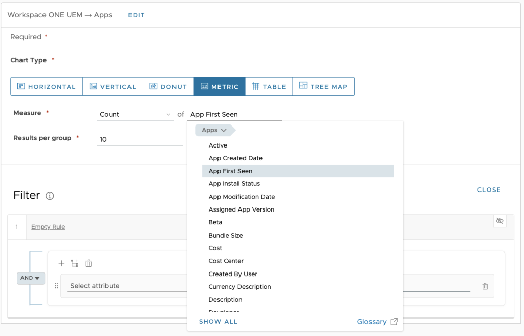
Workspace ONE Intelligence supports several data sources. If a user isn’t familiar with all the attributes available with each data source, it can be challenging to pick the right one. From now on, we will display only the primary category attributes in the filter dropdown. Everything else will be collapsed under “Show All.” For example, if you select the Workspace ONE UEM data source and Apps entity in the first widget selection, in the next step we will show “Apps” as the primary category in the filter dropdown and all the attributes associated with Apps. Other categories, such as “Device” and “Users,” will be collapsed under “Show All” and can be accessed as needed. This will help users find what they need easily without having to scroll through a long list of attributes.

Query builder improvements
3. Added color picker for widget color theme
We’ve updated the color palette for widgets because colors are important for data visualization. With this new feature, we enable customers to take control over how the data is represented, and they can now match it to their brand or sentiment with more flexibility.
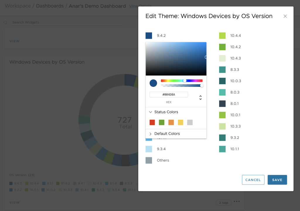
In the “Edit Theme” modal, you can see the theme colors. Selecting a color opens a color picker. With this color picker, you can choose any color in the color palette, and you’ll also see the hex value in the input box. Status colors will show the theme color selected by the user, from light to dark. We also provide some default colors.

Color picker
4. Widget overlays
Until now you have been deriving insights from individual widgets based on a single dataset. But what if you want to compare, correlate, and identify patterns of multiple datasets within the same widget? This is precisely where our latest feature, “Overlays,” comes in. With the addition of this feature, you can pick any two historical datasets and overlay one over the other in the same widget.
Widget overlays are useful when you want to compare two different datasets over the same time range, or when you want to monitor multiple metrics simultaneously. With the new color options mentioned above, you can get a unified view within a single widget and customize it as you like.
Widget overlays support historical and custom trends data types. This means that you can view two datasets spanning a period of time in one widget. To visualize the two datasets you can use vertical columns for one dataset and a line for the other, or two lines.
In this demo video, I show you how to set up widget overlays in detail, as well as a few use cases for them. For more information about this feature please read this documentation.
We’re excited to share these new widget enhancements with you, and we hope they will provide you with an even more intuitive and efficient user experience in Workspace ONE Intelligence.


