

We often ask ourselves, “What’s next?” and “How can this new feature bring value to me and mine?” We place our focus on the next new thing and tend to overlook the smaller improvements made to a feature or product. As such, this series of micro-blogs will focus on the user interface improvements rolled out in Workspace ONE Intelligence by our outstanding UI team, with this first article focusing specifically on the enhancements made to the query builder.
For those who aren’t familiar with the term “query builder” or what exactly it references, it’s the piece of UI that helps you build out your filters. It’s used across many of our offerings that include functionality like widget and report building and automation workflow creation. Since the query builder has such a large footprint across our products, we wanted to improve the user experience and focus on making it easier for admins to utilize.
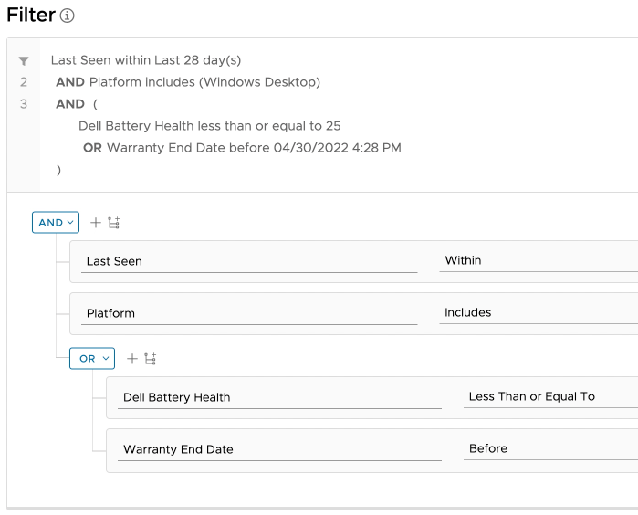
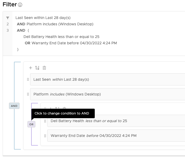
One of the most noticeable changes is the location of the ANDs and ORs. They’re now aligned to the left and centered on the brackets that encompasses the rule(s) and/or ruleset(s) that the conditions apply to. This change makes it easier for users to comprehend visually which rule(s) and/or ruleset(s) are nested and how they relate, which is not the case when compared to the original design. Another change to the conditions is the removal of the drop-down arrow to switch between AND and OR. The new UI toggles between the two with a click from the end-user.
Here’s the old UI:
And here’s the new UI:
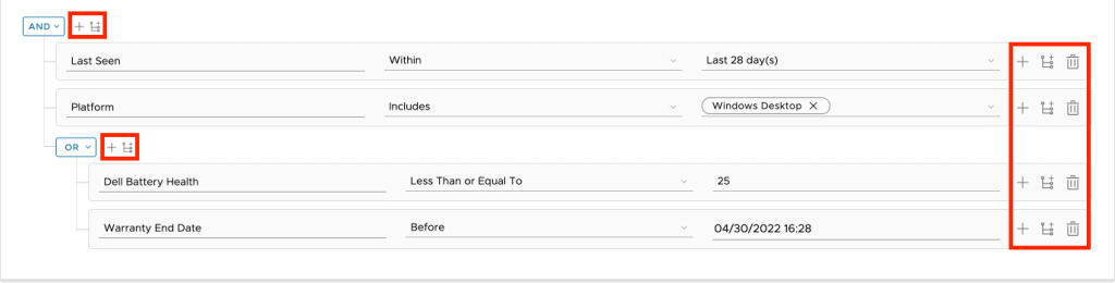
Working our way inwards, the next change deals with the centralization of the add rule/ruleset icons. Previously, users would see three options on the far right of a rule. These options would allow users to add a rule, add a ruleset, or delete the current rule. Additionally, they would have icons right next to the conditions with the ability to add a rule or ruleset from there, as well.
Here’s the old UI:
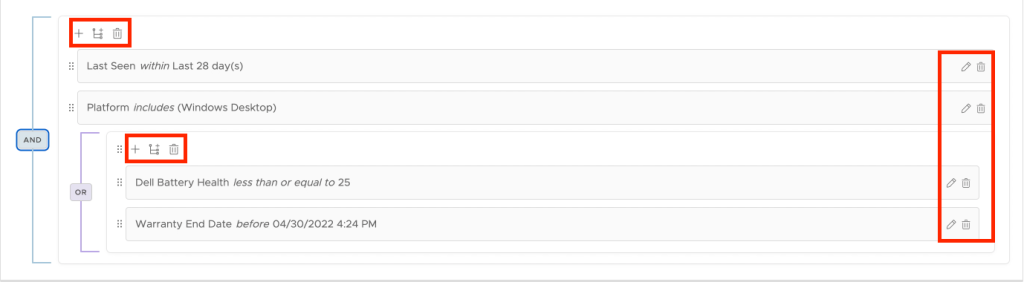
The redesign of this functionality eliminates this redundancy by reducing the options for each rule down to two: edit and delete. If an end-user wants to add an additional rule/ruleset to the corresponding nested loop, they can do so by using the icons located at the top-left of the condition bracket. Users can also re-order the rule or ruleset by dragging and dropping, using the six-dot indicator located to the left of the line item.
Here’s the new UI:
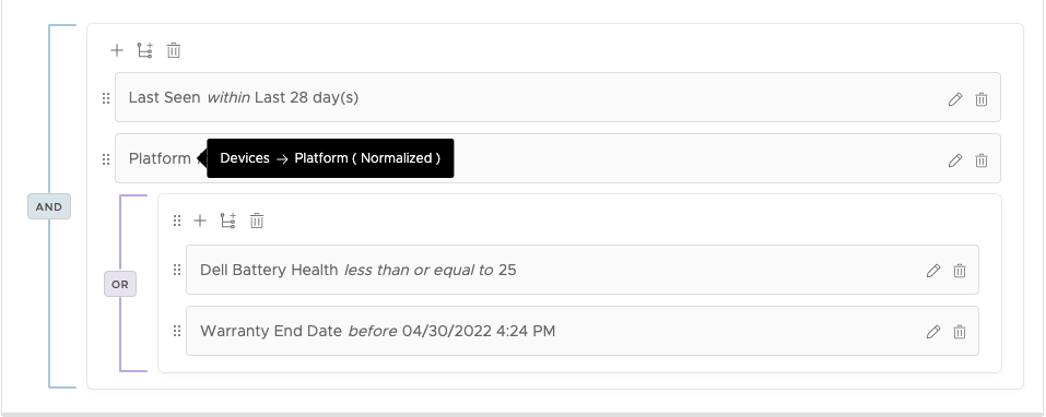
Speaking of editing, we’ve introduced a read-only mode to accommodate large complex queries built with expanding customer needs. This mode converts the three input boxes into sentence form when a user clicks away from the rule, making it a lot easier for end-users to read. Users can also hover over attributes when in read-only mode to obtain more information regarding the attribute’s path and if that attribute is normalized.
Here’s the read-only mode tooltip:
The changes mentioned above are just a few of the first of many that are still to come. If the content within this article interests you, please be sure to keep an eye out for the larger changes coming out later this year.


