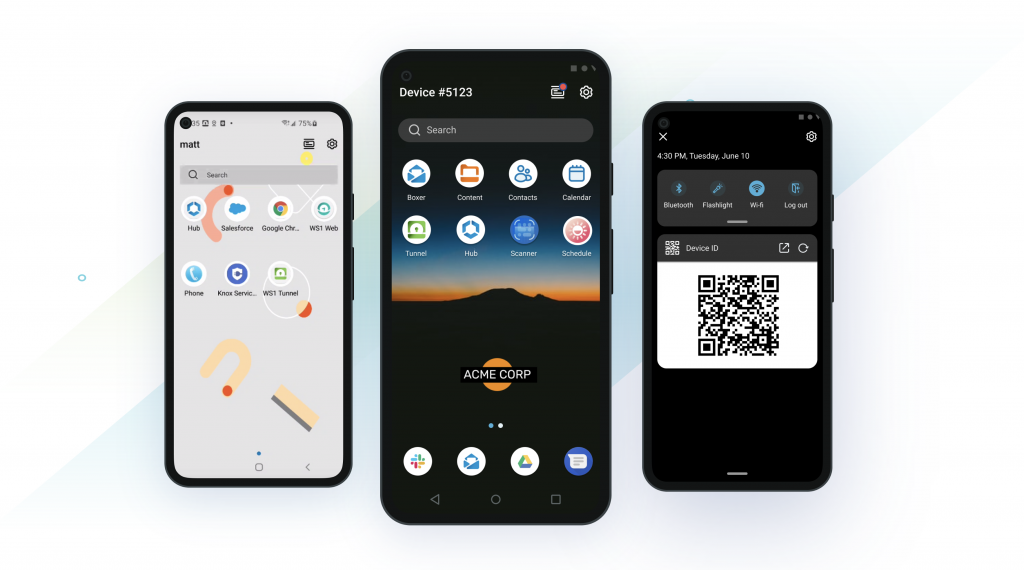
Since the introduction of Launcher over five years ago, we’ve released numerous features to make the product the backbone of many mission-critical device deployments. With the release of Workspace ONE Launcher 21.09, we are excited to introduce a revamped user experience and a new widget framework that provides unparalleled customization for your frontline worker use cases.
In our latest Android Series video, I join Kenny Takahashi to discuss Launcher’s new features and how admins can take advantage of them.
In the Launcher 21.09 release, we redesigned every UI element to align with enterprise accessibility guidelines and introduced new features to provide an intuitive, consumer-simple interface.
- A simplified interface de-clutters the home screen, making it easier for users to access the most important apps and features.
- Dark and light mode theming enables Launcher’s UI to align with your business’ visual branding and wallpaper.
- The search bar makes finding apps across multiple pages and folders quick and easy.
- The drop-down menu features a new icon that better matches the user experience.
- The native flashlight app is easily found in the quick access menu.
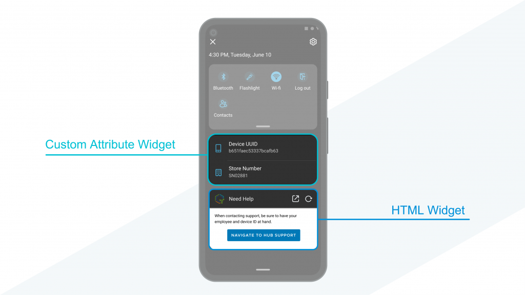
Widgets allow for unrivaled customization without jeopardizing discoverability and usability.

- Launcher’s HTML widget enables admins to create custom HTML or web-based UI in a way that feels native to end-users.
- Launcher’s custom attribute widget displays important data in an intuitive list.
Learn more about these important changes shipped with Launcher 21.09 in this Knowledge Base article.


