

Companies turn to Modern Management to support the ever-evolving needs of their organizations, from managing a myriad of devices and apps to delivering the best employee experience from onboarding to retirement.
To do this, they need to be able to track and measure a wide range of KPIs across their environment — for example device adoption, security posture, OS updates, app upgrade rollouts and many more.
IT Administrators not only need to know how their deployment looks like at this very moment but are also interested in knowing how their deployment got to the current state, so that they can use this data to forecast success and track progress.
Workspace ONE Intelligence captures an endpoint’s current state as well as historical data about all the events that occurred, and can help identify long-term trends and patterns.
We have crafted out-of-the-box Dashboards in Workspace ONE Intelligence to cover the most common use cases for our customers. The most recent additions are the Events and Trends charts included under Devices, OS Updates, Security and App detail dashboards.
In an Event chart, each data point is plotted based on the change in the state of the attribute (being plotted) reported in the system at a specific date-time over a course of selected date range.
In a Trend chart, each data point is plotted by counting the state of the attribute (being plotted) reported by all the devices in the system for a specific date-time over a course of selected date range.
Event and Trend charts for device management
Let us take a simple use case where an administrator is managing corporate mobile devices for its employees.
The goal for this administrator is to ensure all mobile devices are enrolled and actively being used by the employees. This gives assurance that the devices are in use and not lost.
A quick glance at the Devices > Mobile Devices Dashboard can help administrators understand the overall status of the deployment.
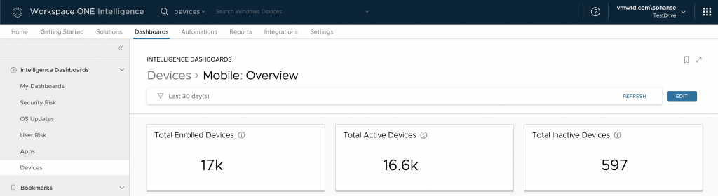
The widgets listed here tell you the total enrolled devices, total active devices and the total inactive devices counts as seen in the system at the moment. The active and inactive devices are determined based on the last time a device checked in. If they checked in within the last seven days they are treated as an active device. Otherwise, they are considered as an inactive device.
Based on these metrics, administrators can gauge how active the employees are and if the devices are being used or not.
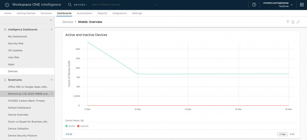
Furthermore, you can forecast how the active and inactive devices have been trending so far by using the Active and Inactive Device widget.
In a healthy environment, devices should constantly check-in which will be indicated with a steady line for active devices, and the number of active devices should match closely to the total enrolled devices. If there is a sudden drop in active device counts, this could indicate a deployment issue that is affecting employee productivity.
You can click the VIEW option to drill down further to get a better look at all the inactive devices with their details.
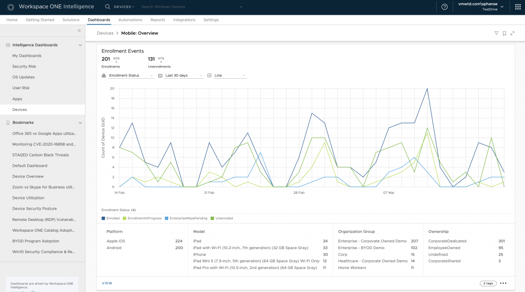
The Enrollment Events widget (above) shows the devices as going in and out of enrolling, unenrolling, pending enrollment and enterprise wipe state. Typically, you will not see much activity here unless there is a new rollout of mobile devices planned. This chart can help you gauge how fast the devices are being adopted and when rollout will end successfully.
Let’s walk through the KPIs listed on this chart.
- Enrollments: The number of enrollment events seen in the last 30-day time period. The percentage metric next to it shows if the enrollments percentage went up or down as compared to the previous time.
- Unenrollments: The number of unenrollment events seen in the last 30-day time period. The percentage metric next to it shows if the unenrollment percentage went up or down as compared to the previous time.
- Platform: Groups the Enrollments count by platform. Gives insight into which platform is getting adopted the most.
- Model: Groups the Enrollments count by model. Gives insight into which model is getting adopted the most.
- Organization Group: Groups the Enrollments count by organization groups. If the organization group is represented by department or region, this metric can help you understand the earlier adopters.
- Ownership: Groups the Enrollments count by ownership. This helps you understand the adoption based on corporate versus BYO devices.
Use the Enrollments Trends chart to understand how the enrollments are trending for your deployment. You would want to see a steady growth on this chart if it is a new deployment where new enrollments are occurring every day. Otherwise, this chart is expected to be pretty linear.
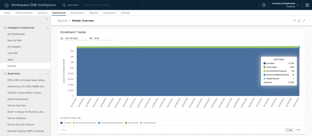
And just like that, you can track the velocity of enrolling devices and how they are trending in your environment.
How to create a customized Event widget
While there are Trend charts available throughout Workspace ONE Intelligence in various out-of-the-box dashboards, Intelligence doesn’t yet allow users to create a custom widgets based on Trend data. (We will be adding this functionality in the future.) However, users can create a custom widget on Events data today.
Let’s learn how to create a custom widget with Events data. IT administrators are always aiming to ensure all the users are productive and can access corporate resources quickly and easily to get their work done. This includes basic functionalities like corporate email configured correctly on end user’s device.
With Workspace ONE Intelligence, you can create a custom widget to track the current status of corporate email installations. Use the Workspace ONE UEM > Profiles data category to do the same.
Now let’s track how the profile installation has progressed over the past month. Follow the steps below to create an event chart.
- Navigate to Workspace ONE Intelligence console > Dashboard > My Dashboard and create your own dashboard or edit an existing one.
- Add a new widget to your dashboard and choose Custom Widget.
- Choose Device Events, App Events, OS Update Events or Profile Events data categories to create your custom widget.
- Use the below guideline to create a successful event chart. In this example, we are tracking Email profile installations.
- Pick you chart type. Events charts are best represented as a LINE chart.
- Measure is always Counted on “Device GUID” as it tracks the corresponding events seen in the system.
- Select any Group by option(s) as applicable.
- Filters must include “Event Name” and choose any of the supported values. This indicates which change event you are interested in tracking.
- Add additional filters to narrow your search. E.g., Enrollment Status, Profile Name, Profile Configuration Type, Profile Payloads Installed and Platform as needed.
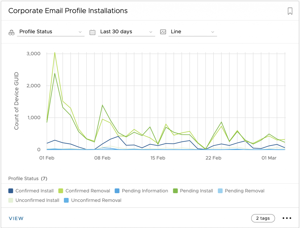
There you go! Within seconds, you can track the velocity with which devices are installing your email profile within your deployment.
We would love to hear feedback from you on this new functionality. Please do not hesitate to reach out to your CSM to contact the Intelligence team.
I hope you found this information helpful. In my next blog, I’ll focus on security dashboards. Stay tuned!


