

With more enterprises embracing the anywhere workspace, securing digital resources has become crucial for IT administrators. Sometimes the goal is to keep the deployment in a zero compromised and zero non-encrypted state. While that’s a great KPI to track, it is also important to know any anomalies that may occur indicating endpoints may be under attack. Workspace ONE Intelligence Security Risk and Operating System Updates dashboards can show any such anomalies represented by a spike on the Event charts.
Tracking mobile operating system updates
Operating system updates include new features as well as security fixes that might be critical, so you want to ensure all the devices in your organization are secure. Let’s start with mobile devices
Since OS upgrades on mobile are automatic, you tend to see a gradual increase in the devices upgrading to the latest OS version. There may be cases where devices are offline or no longer compatible with the new OS version. In such cases, you may never reach a 100% OS upgrade rollout on your mobile. Let’s take Apple iOS for example.
The OS Update dashboard can tell you the adoption rate of your mobile fleet under the OS Update Events chart. You can further drill down and see the breakdown of the devices that upgraded by OS version, manufacturer, model and organization group.
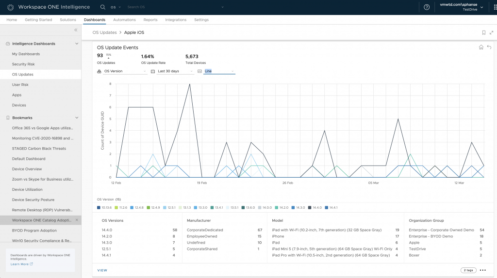
Let’s go through all the metrics represented on the OS Update Event chart:
- OS Updates – This gives the total number of device events seen over the last 28 days that went through an OS update.
- OS Update Rate – The rate at which the devices took an OS update over the last 28 days.
- Total Devices – This represents the total number of devices seen in the system.
- Platform – OS updates grouped by Platform, indicating which platform is updated the most.
- Model – OS updates by device model. Indicates which device model updated the most.
- Organization Group – OS updates grouped by Organization Group. If organization group represent region, this will help identify which region updated the most.
- Ownership – OS updates grouped by ownership. Indicates if corporate devices are adopting the new OS update.
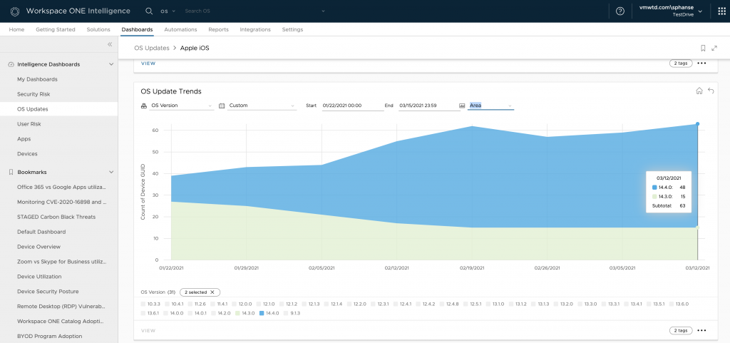
Navigate to the OS Update Trends chart to check how quickly the new OS version is being adopted. You can narrow your search by editing the global filters and selecting only the OS versions that you are interested in.
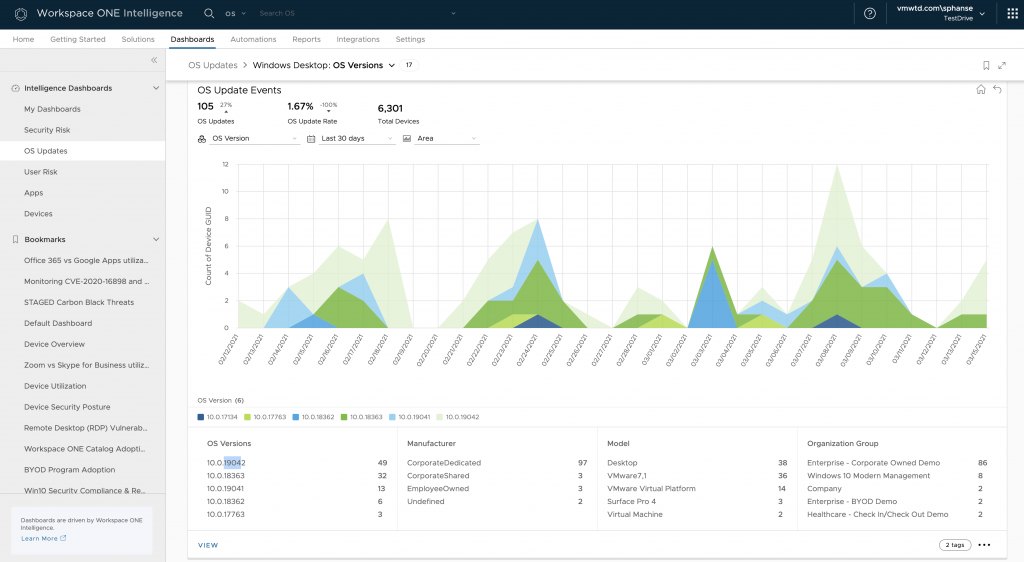
Tracking desktop OS updates
While OS upgrades are automatic on mobile, there are a lot of things to consider before OS updates are approved for broad rollout on desktop. IT administrators must make sure the new OS version released is tested out to catch any user experience and app compatibility issues that can hamper employee productivity and in turn increase IT help desk ticket volume. Check out the Windows Desktop > OS Update Events chart to learn more.
Tracking compromise and encryption status
Another important security measure is the compromised and encryption status of endpoints. Ensuring devices are not compromised and encrypted is key to secure corporate data when a device goes under attack.
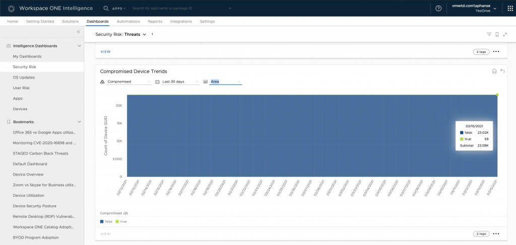
Navigate to the Security Risk dashboard to locate the Compromised Device Events and Trends charts. The Compromised Device Events represents all the compromised device events seen in the system within the last 28 days. Events here means devices that changed their state and became compromised.
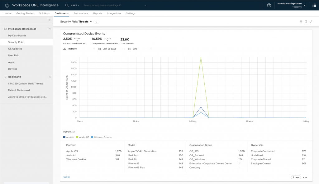
Let’s go through all the metrics represented on the Compromised Device Event chart:
- Compromised Devices – This gives the total number of compromised device events seen over the last 28 days.
- Compromised Device Rate – The rate at which the devices changed their state to being compromised over the last 28 days.
- Total Devices – This represents the total number of devices seen in the system.
- Platform – Compromised devices grouped by Platform. Indicates which platform got affected the most.
- Model – Compromised devices grouped by Model. Indicates which device model got affected the most.
- Organization Group – Compromised devices grouped by Organization Group. If organization group represent region, this will help identify which region for affected the most.
- Ownership – Compromised devices grouped by ownership. Indicates if corporate devices are under attack/risk.
The Compromised Device Trends chart indicates how the devices have been trending historically. In an ideal deployment, you will not see a lot of compromised devices unless Workspace ONE UEM marks the device as compromised under specific conditions (jailbroken being one of them).
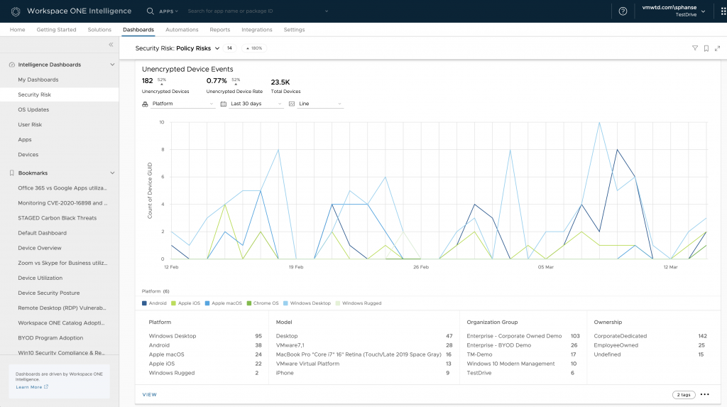
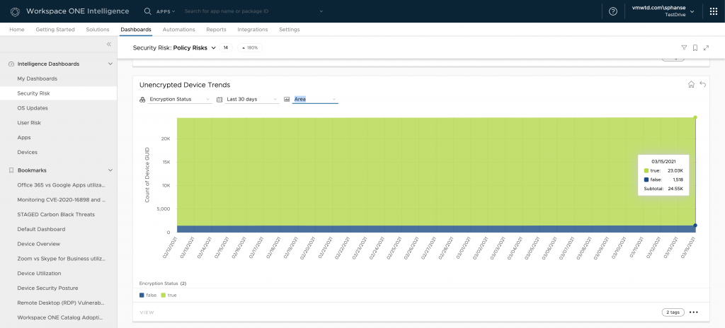
Additionally, check out the Unencrypted Device Events and Trends charts to monitor the encryption status of devices. The metrics represented here follow the same pattern as you saw in previous charts.
Custom Dashboards
If you have a use case which is not covered by any of the pre-canned Dashboards in Workspace ONE Intelligence, you can create your own Dashboard and add widgets to it. In my previous blog I walked through an example for that.
I hope this is useful for you. There is so much more you can do with Workspace ONE Intelligence. Please share with us your most useful custom dashboards – we would love to hear your story!


