Starting in June, leading up to FinOps X in San Diego, the VMware Tanzu CloudHealth team has been teasing a new CloudHealth user experience. While in San Diego at FinOps X, those in attendance were lucky enough to get a tech preview of it live at the Tanzu CloudHealth booth in the Expo.
Throughout the Summer, we have been bringing the new user experience into the context of a user’s journey in cloud maturity, and aligning it to the FinOps Phases developed by the FinOps Foundation. At the beginning of July, my colleague did a deep dive into how the modern FinOps Practitioner will be able to leverage the new Tanzu CloudHealth experience throughout the Inform Phase of their FinOps journey. Two weeks ago, I shared how the new Tanzu CloudHealth experience assists users as they move through the Optimize Phase.
What does it look like to be in the Operate Phase?
This week, I am jumping into how the new user experience aligns with the modern FinOps Practitioner during the Operate Phase. Before we share some of the new functionality inside the new experience, it’s necessary to take a step back, dive into the Operate Phase, and digest what the Operate Phase is and is not. As per the FinOps Foundation, the Operate Phase involves “implementing organizational changes to operationalize FinOps using the data and capabilities developed in the Inform and Optimize phase.”
Too often, the FinOps Phases are oversimplified and confused with the cloud maturity model of “crawl, walk, run.” In this case, Operate does not always equate to running. Organizations are unlikely to run 100% of the time across 100% of their organization, and often, technology advancements or even regulations could force an organization to rethink how they use the cloud. The focus on Sustainability and GreenOps or the proliferation of AI everywhere are great, recent examples of when technology steps in and makes an organization re-evaluate or redefine how they look at technology and the use of the cloud. This mentality is supported by the idea that was shared as the theme of FinOps X San Diego 2024, “there are no runners.” FinOps Foundation shared that “FinOps Maturity is not a measure of how good your FinOps practice is. Crawling is not bad. Running is not good. And walking is not somewhere in between. Maturity does not equal goodness, quality, or even experience.”

Instead, at its core, the Operate Phase is about organizations continuously rebuilding and refining the workflows, collaboration, and processes that were developed throughout the first two phases and assisting customers with their FinOps maturity as that is never done.
Operate Phase and the New User Experience
With this constant improvement, refinement, and growth in mind, the Tanzu CloudHealth team dedicated the new experience to how the modern FinOps Practitioner would leverage the platform throughout their Operate Phase.
The first piece of the new user experience targeted at how FinOps Practitioners interact during their Operate Phase is the brand new Realized Savings Dashboard. It has affectionately been referred to as the Hero Report. It was designed to provide users with quick insight into how much they have saved month over month or how well covered their infrastructure is by Commitment Discounts. As a part of the Operate Phase, users will be able to leverage this new dashboard to see how their cloud usage has been impacted by actions taken throughout the Inform and Optimize Phases. Like all of the other dashboards, the Realized Savings dashboard is customizable with the widgets that are crucial to the user’s day to day.
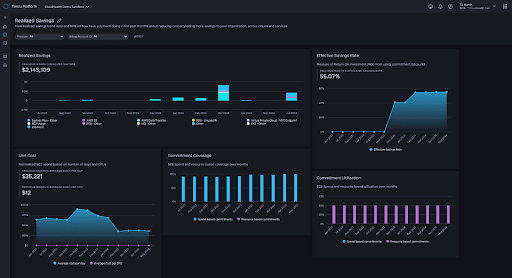
There are 5 new widgets enabled by default that make up the Realized Savings dashboards. The widgets include the Realized Savings widget, Effective Savings Rate, Unit Cost, Commitment Coverage, and Commitment Utilization. Each of these widgets provide a unique insight into how cost efficient a user’s cloud infrastructure is running.
Realized Savings widget
This widget will typically be the first thing users see when they navigate to the new Realized Savings Dashboard. Located at the top of the dashboard, the Realized Savings widget provides users a glance at Month over Month savings broken down by resource. Designed for a quick reference, the Realized Savings widget showcases the previous month’s realized savings in the top left hand corner.
Effective Savings Rate widget
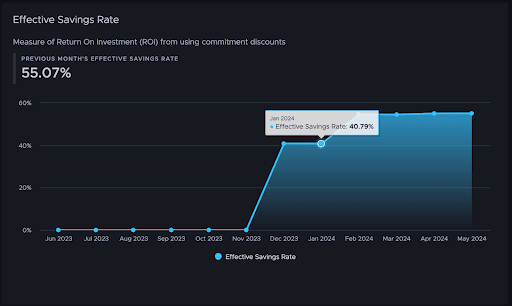
The Effective Savings Rate widget provides users a glance at the measure of return on investment from using commitment discounts, including negotiated discounts, for all reservable instance types. In the screenshot below, we can see a customer who jumped from a 0% Effective Savings Rate to around 41% at the end of last year, and then up to over 55% since February. By providing users insight into this metric, they are able to get a good idea of how they are staying cost efficient with their cloud infrastructure.
Unit Cost widget
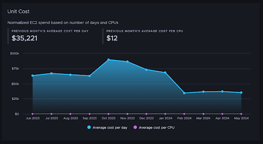
For the Tanzu CloudHealth Unit Cost widget, users are able to see normalized EC2 spend based on number of days and number of CPUs. By showing users the previous month’s average cost per day and previous month’s average cost per CPU, customers will be able to track how their cloud infrastructure is performing against a specific unit of measurement. In this example, customers can see their previous month’s spend broken into a more tangible metric, like per CPU usage for this example, instead of Hours of EC2 Usage.
Generally, customers usually want to get their per unit cost as low as possible. This widget gives users the ability to see how their unit cost has been trending. A low unit cost is ideal, while a higher cost ultimately impacts a customer’s bottom line. To make a significant impact to their unit cost, a user wouldn’t simply be able to reduce the number of their CPUs. For this example, our customer would have needed to make a decision like changing architecture or instance family, or to start leveraging Commitment Discounts.
Commitment Utilization & Commitment Coverage widgets
Another two default widgets are the Commitment Utilization and Commitment Coverage widgets. The Commitment Utilization widget provides users visibility into their EC2 spend and resource based utilization over the past 12 months. The Commitment Coverage widget shares the EC2 spend and resource based coverage over the same time period. With these 2 new widgets, customers are able to get quick insight into how much of their EC2 usage is covered by both Spend-Based and Resource-Based Commitment Discounts.
For Commitment Utilization, it is generally viewed that a high utilization percentage is ideal. If a customer is seeing lower utilization, or even a steep drop in utilization, there is usually some investigation that needs to be done. A steep, dramatic decrease in utilization could be an indicator of a drastic change to architecture. A change like this could point to a reduction in instances or even a migration to a different family.
For Commitment Coverage, there’s no “golden rule” or standard for what coverage percentage should be. A general rule for coverage, though, is that any usage that is considered to be stable and on-going should be covered. If there is a steep increase, it could indicate a purchase of more Reserved Instances or a reduction in usage. If coverage drops, it could indicate an expiration of Reserved Instances, some instances have migrated to different families, or there was an increase in usage.
By leveraging both of these new graphs, customers can easily get insights into how well their commitment discounts are being leveraged. If a customer is experiencing a high utilization, but a low coverage, it might be time to buy some more Reserved Instances and increase the total coverage. But if there’s a high coverage, and a low utilization, what does that mean for the customer’s cloud environment?

Looking Ahead
The Tanzu CloudHealth has just been getting started with the new CloudHealth experience, and with plenty more on the roadmap for it, including classic CloudHealth things like Policies and Perspectives. During the Inform and Optimize Phases, we shared some of the features like Smart Summary and Intelligent Assist. These two features specifically have shown to have use cases across all FinOps Phases, and as enhancements continue to roll out we’ll see some additional use cases leveraging these powerful, AI based tools to help users throughout the Operate phase.
Another enhancement, slated to come later this summer, is Custom Widgets and Dashboards. This customization will provide CloudHealth users with a new way to collaborate across the organization. Creation of new dashboards and widgets give users the ability to align with specific business units and team members and provide them with the information that is most important to them and their business. The customization helps users continue to refine and grow their cross team collaboration.
Take the Next Step with Tanzu CloudHealth
Since FinOps X in San Diego, the Tanzu CloudHealth team has shared some of the new features that will be available inside the new user experience. We have shared how each feature has been meticulously crafted to align with the demands of the modern FinOps Practitioner. Regardless of which phase an organization finds itself in, Inform, Optimize, or Operate, users will find ways inside the new user experience to assist them throughout their journey. Let the Tanzu CloudHealth team come alongside you in your FinOps journey by checking out our website.
