Customer satisfaction has always been important to VMware. vSphere Client presents the ability to work with one or multiple linked vCenter Servers in a user friendly way. Yet, mapping API functionality to user experience can be quite a challenge in some cases. If this is not done well, the frontend workflow can be really difficult to use. Whenever we find such workflows, we strive to improve them. This has led to the improvement of a couple of UI workflows in Cluster UI.
DRS Recommendations View
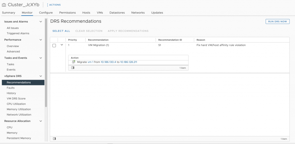
Prior to vCenter 7.0 Update 3, it was quite difficult to make out the information in Cluster UI → Monitor → DRS Recommendations view.

Major flaws were the difficulty to map actions to a recommendation and the lack of recommendation ID. The former relied on indentations which didn’t give clear border of the actions comprising a given recommendation, while the latter was missing – and IDs are very useful while trying to find a specific recommendation in the logs.
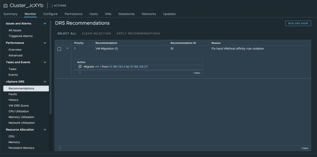
Thus, now the DRS Recommendations grid uses expandable rows, that are expanded by default and each row contains the recommendation and a grid with its actions. This allows the user to immediately see what actions are to be applied and with two clicks (Select All and Apply Recommendations) apply all the recommendations.

Select All and Clear Selection link buttons were added for easier manipulation of the recommendations. Apply Recommendation action has been moved as a datagrid button as well.
The UI plays well under Dark Theme as well:

Edit Proactive HA Dialog
The Providers tab of this dialog is a very good example of the challenge when mapping API to UI. This is how the Providers tab of the dialog used to be:

Our major goal was to make the tab intuitive and easy to use. The first step was to add toggle per each provider in the datagrid that both provides visually quick understanding of the state of the provider (previously one had to read it, which is a bit more cumbersome) and a click away from enabling / disabling the provider.

Same goes for Filter Conditions per provider. We have added toggles in the datagrid in order to make blocking visually more understandable. Of course, in cases where there are many filter conditions, one has to be able to block / unblock all conditions, though that is not that common use case. Thus, there are two new link buittons on the right of the grid: Block All and Unblock All.

The UI elements have been rearranged as to follow the intuitive workflow of the dialog. Check boxes have been replaced by toggles as they give better experience at enabling / disabling, while checkboxes might expect some other action.
We really hope that all these improvements make one’s work easier and much more enjoyable.
Please, share your feedback in the comments section below or reach out to us – vSphere UI Community Team (@vSphereUI_Team).


