VMware
ESXi Host Client
updates
The product and engineering teams are announcing an improved user experience and consistent design in the ESXi Host Client. Starting with the release of vSphere 8.0 and backported to vSphere update 7.0 Patch 6, both users and administrators can benefit by upgrading.
This article summarizes the technical user interface achievements and conveys the evolution since version 1 with a background on its history.
⇒ Customer Notice: The current released Host Client still remains in maintenance mode as the product team is working toward a replacement application. Updates and communication will be provided in the future.
History of design and branding

Since the initial customer-facing version of the Host Client UI as a fling, the adoption and demand from home lab users to enterprise customers has been remarkable. In response to keeping the application modern with designs found in other VMware products, the Host Client engineering team has finished the first series of delivering a more consistent experience.

The first prominent change is the visual identity of ESXi client and server, now shown by a new icon in the VMware family. Painted with the corporate blue and green color palette, this icon drawn from minimalistic shapes, speaks to the software’s heritage of virtualization. This shift away from real-life images is intentional, to give the branding a unique and refreshing look.
Visual elements

Improving user experience involved reconstruction of the core elements. Wizards, forms, buttons, tabs, panels in the client received visual treatment from Clarity, VMware’s open source design system. Taking guidance from other established applications, changes were made to drive an intuitive look that converges on style, feeling familiar to users of the vSphere Client. The implementation of a new design language resulted in an open appearance, with liberal use of space, more legible typography and modern appeal.
With gratitude to the VMware user research conducted, following these newer patterns leads users along quicker in their workflows with less confusion.
New look, same workflow
Going through a virtual machine creation involves the same steps as before, but the modal redesign here offers more breathing space and is balanced in terms of its visual hierarchy of steps and button placement.

The datastore browser layout has changed to be more readable. The top row of buttons in the top toolbar offer file system management such as multiple background file upload, download and folder changes.
The layout width of the multiple columns are resizable to suit larger scale datastores. A user can drag the gripper icon with six dots just under each column’s scroll bar area. Also tucked away in the bottom right corner of the modal is a resizer for itself.

Iconography
Over a 100 new icons now replace the original collection. These flat design vector artwork illustrations from the Clarity icon library bring alignment with the vSphere Client. Notably all icons, except status and country flags, are displayed in monochrome. These simple, easy to understand icons remove visual fatigue that users expressed with the older colored icons found in version 1.
Portlet with an expandable list of virtualized device icons

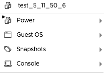
View of the virtual machine drop-down menu with configuration icons shown

Accessibility

The recognition and commitment to accessibility at VMware is important to help create a level field for everybody. Turning focus to accessibility improvements in the Host Client, the long-term goal is to reach WCAG 2 compliance. Taking steps this release, a prominent focus ring is drawn around each form, tab, link, grid cell element to better accommodate users.
Navigating through tabs and action bar buttons are now more simplified.

Form controls and inputs are all updated with a focus outline

User theme preferences

The Host Client will ship with three preset themes. By respecting users personal choices and habits, theme color customizations can now be extended to feel more productive in diverse work environments.

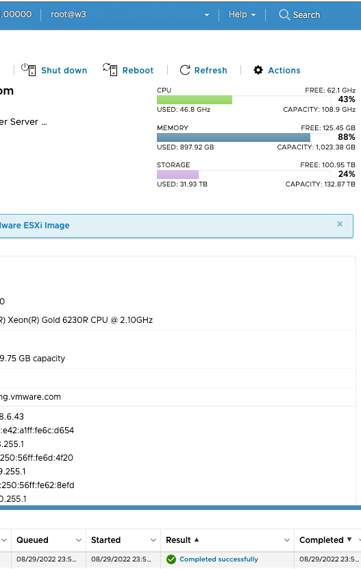
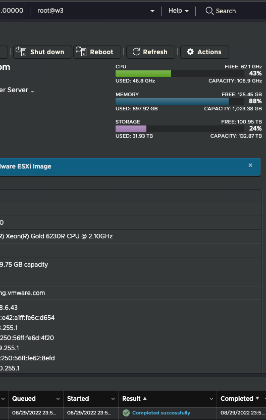
How to get started: From the top of the screen, navigate to the about screen by Help > About. Find the UI Preferences Theme drop-down. The selection can be changed to any of the three themes shown on the left.
As the initial shipped default, light mode is a modern adaptation with sensible, cooler monochrome hues and softer contrast between text and panels.

The classic theme borrows from the original palette with a bright white background.

The new dark mode is recommended for those with light sensitivities or working later in the night.

To edit theme colors, launch the theme editor via the CUSTOMIZE… button. In this modal dialog, a user can freely change colors from any of the 10 different sections of the interface. Each gray slider affects the color opacity.
For example, clicking on the color swatch will open a small color window. Picking a color here allows for a real-time preview in the underlying Host Client. If, at any time a user wants to revert to the VMware theme default, click the RESET button at the bottom of the editor. To confirm, press ENABLE and the preference will save to the browser’s local storage.

Administrator login banner
With an ever-growing awareness in security, it is strongly recommended to add a banner message to warn and inform those who attempt to access to the ESXi host. While posting a short keep out message alone won’t thwart intruders, presenting legal consequences may deter a bad actor.
Administrators have the opportunity to author the login page banner content by writing using a subset of markdown, a popular lightweight formatting language. By editing the text file /etc/vmware/welcome directly on the host, the client will render its contents in a box to the right of the username and password fields of the login page.

For example, a fictitious cloud storage company Vaulted has a login banner page, complete with logo, links and a required accept checkbox message on the form.
For further details please read the product documentation notes for in-depth samples of the markdown and variables used to author the host welcome text file.

Browser support
Due to industry security concerns, support for Internet Explorer 11 is effectively removed, which follows the VMware announcement from 2020 in a similar note for the vSphere Client. Microsoft’s guidance notice has been to encourage its customers to adopt the Edge browser, which shares the many of the web standards as Chrome.
About Host Client

The VMware Host Client is an HTML5-based UI client that is used to connect to and manage a single ESXi host. It can be used to perform administrative tasks on the host such as VM creation, networking and storage provisioning. This client is an alternative to troubleshooting individual VMs or hosts during times when vCenter and the vSphere Web Client are unavailable.
Sharing feedback and joining other users of the Host Client is welcome on VMware Communities.

