

In this blog, we cover how to build a custom theme in VMware Cloud Director. To skip the introduction and dive right into easily creating a forward-compatible VMware Cloud Director theme, just click here!
Introduction
Customizing VMware Cloud Director
Our customers–cloud providers–buy VMware Cloud Director. Some of them provide a Cloud Director-based solution directly to their tenants. Other cloud provider would prefer to present their own cloud solution to their tenants, powered by Cloud Director as a platform. My work over the years to make Cloud Director more extensible (or more easily extensible) represents one facet of addressing the needs of a specialized cloud solution. But there is an even simpler feature that serves as the foundation for any customized solution. The ability to “white label” the Cloud Director UI to bring it in line with your corporate brand is an easy first step to delivering your cloud solution to your tenants.
A Brief History of Themes
Cloud Director has included some concept of branding/theming since some of its earliest Flash-based UIs. Over the years it has been rightfully accused of a variety of transgressions:
- way too complicated
- doesn’t allow nearly enough flexibility
- can’t be customized at a per-tenant level
- breaks…with every single product upgrade
With Cloud Director 9.5 we started to revamp our approach to themes. You could change the header color, logo, and product name via a simple API call. Additionally, you could apply themes on a per-tenant level. You could even use the Theme Generator utility to recreate Cloud Director’s entire CSS. It was going to be a new era for themability…
And then it would be time to upgrade Cloud Director.
And then things would turn a bit…funky. The VDC ribbon started wrapping in disorienting ways. Data grid headers stopped aligning themselves to data grid content. Providers would have to recreate their themes, and we’d have to put out new versions of the Theme Generator (v10.1).
The Problem With Upgrades
Cloud Director is built on top of the Clarity project. As Clarity puts out new LTS versions of the library, Cloud Director appropriately upgrades its code to use these new libraries. This unfortunately makes the full CSS-based theme approach fragile. When a new version of Clarity tweaks the class selectors that drive component layouts, CSS generated with older version of Clarity (i.e. Theme Generator) isn’t able to drive the component layout the way the new version intends. If a new version of Clarity changes the name of a SASS color variable, the variable used by the old version no longer works. When new Clarity adds a variable, old Clarity doesn’t know about it and can’t account for it.
How can we make theming more robust, without sacrificing the high level of customization introduced in 9.5? The answer lies in CSS custom properties.
Creating Custom Themes in Cloud Director 10.2
Technical Summary
Of the upgrade issues mentioned above the most problematic is the layout changes. A missing color looks unappealing, but layout issues can render the UI unusable. From a branding standpoint a custom theme shouldn’t need to do anything with layout styles. So we’d like to defined just the colors, but not things like display: flex or box-sizing: inherit, in a custom theme. As mentioned in the last section CSS custom properties (or CSS variables) allow us to do just that. Instead of a theme needing to recreate the entire selector definition for the vertical navigation component:
|
1 2 3 4 5 6 7 8 |
.clr-vertical-nav { flex-direction: column; width: 12rem; min-width: 2.4rem; background-color: #e8e8e8; will-change: width; transition: width 0.2s ease-in-out; } |
A theme can now just specify a value for the vertical navigation background color without all the other styles:
|
1 2 3 |
:root { --clr-vertical-nav-bg-color: #000000; } |
Cloud Director itself is now always responsible for defining the entire style. This looks exactly like the first code snippet above, with one minor modification:
|
1 2 3 4 5 6 7 8 |
.clr-vertical-nav { flex-direction: column; width: 12rem; min-width: 2.4rem; background-color: var(--clr-vertical-nav-bg-color, #e8e8e8); will-change: width; transition: width 0.2s ease-in-out; } |
This small modification tells Cloud Director to use the variable –clr-vertical-nav-bg-color as the background-color from the .clr-vertical-nav style. And if that variable isn’t defined, use #e8e8e8 (the default color) instead. As the version of Clarity changes, the other styles may change–the width can be changed, or an additional container class added that affects the vertical navigation’s layout. The custom theme is now resilient to any such changes, because it is just defining a color.
Creating the Custom Theme
Armed with all the above information, it’s time to actually make a theme. We’re going to build the theme for the screenshot at the top of this post. We’ll break the work into 3 different parts, the primary header, the vertical navigation, and the main content area. All we need to do is define the appropriate variables for the colors we want. Custom themes will start with an empty :root selector:
|
1 2 |
:root { } |
Primary Navigation
The difference between the top (default) and bottom (custom) navigation bar are the background color and the text color. So we’ll add those variables to our custom theme:
|
1 2 3 4 |
:root { --clr-header-bg-color: #03c805; --clr-header-font-color: #000000; } |
Boom, done. If we upload our custom theme at this point, the primary navigation will look like the bottom navigation bar. But we’re going to keep going, because this is easy and fun.
Vertical Navigation
There are a few more differences in the vertical navigation than in the primary navigation. The background and text color is different, as well as the text color of a selected item and the background color on hover. Let’s update the custom theme definition to account for these colors:
|
1 2 3 4 5 6 7 8 9 10 11 12 |
:root { /* Primary Navigation */ --clr-header-bg-color: #03c805; --clr-header-font-color: #000000; /* Vertical Navigation */ --clr-vertical-nav-bg-color: #000000; --clr-vertical-nav-item-color: #ffffff; --clr-vertical-nav-icon-active-color: #000000; --clr-vertical-nav-item-active-color: #000000; --clr-vertical-nav-hover-bg-color: #f1f1f1; } |
Main Content
In the sample theme, button color is the only additional customization. It is the same green as the primary navigation. This was kept purposefully simple, and we can change the buttons with just a couple more variables:
|
1 2 3 4 5 6 7 8 9 10 11 12 13 14 15 16 17 18 19 |
:root { /* Primary Navigation */ --clr-header-bg-color: #03c805; --clr-header-font-color: #000000; /* Vertical Navigation */ --clr-vertical-nav-bg-color: #000000; --clr-vertical-nav-item-color: #ffffff; --clr-vertical-nav-icon-active-color: #000000; --clr-vertical-nav-item-active-color: #000000; --clr-vertical-nav-hover-bg-color: #f1f1f1; /* Buttons */ --clr-btn-link-color: #03c805; --clr-btn-default-color: #03c805; --clr-btn-default-outline-color: #03c805; --clr-btn-primary-bg-color: #03c805; --clr-btn-primary-border-color: #03c805; } |
Clarity has different types of buttons, and each can be styled independently. Cloud Director uses several of these button types. For instance, there are link buttons for actions on data grid pages, and default and primary buttons in dialog windows. The above variables make all those buttons the green from our custom theme:
Everything Else
The three components listed above along with login page (covered below) give the biggest bang for your buck when it comes to promoting your brand. But Clarity defines its colors in a very granular way. By using the variables in this file as a reference, each individual component can be fine-tuned to the exact theme needs. This includes modals, data grids, form inputs, alerts, and most everything else. Just replace the $ with -- ($clr-global-app-background becomes --clr-global-app-background) and you’re all set!
The :root selector we’ve been adding to is already CSS. So you’ll apply the theme by uploading this directly to Cloud Director. There is no need to run it through a theme generator to build out the entire CSS structure–you just need to provide the custom color variables.
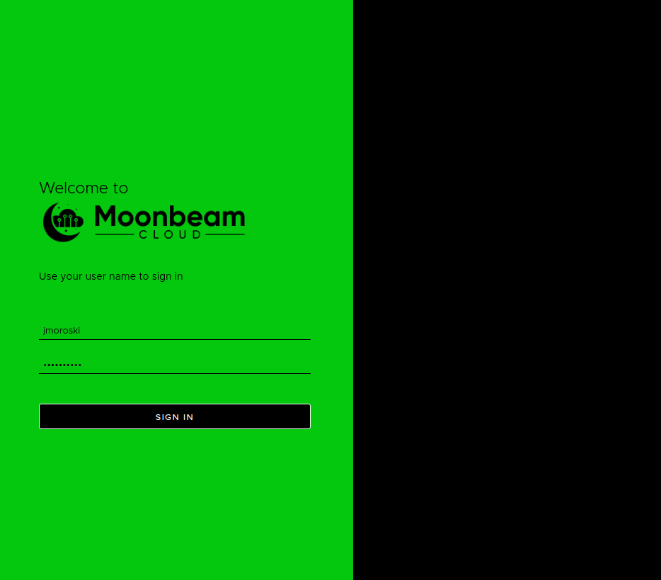
Login Page
The login page deserves its own section for a couple reasons. First, you can’t customize it with just CSS vars. I’m going to go out on a limb and say that most corporate brands aren’t built around a diagonal tartan pattern.
And second, the color/component pairings here may conflict with pairings defined elsewhere. We can resort to plain CSS and better scoping to address both of these complexities.
To get a different background, we’ll just redefine the background style of the .login-wrapper selector:
|
1 2 3 |
.login-wrapper { background: #000000; } |
This is added to the theme file right below the :root {} selector definition. Next, we want to make the form our same green color from the rest of the theme. This includes the form inputs for user name and password. We obviously don’t want these inputs to be green in the rest of the application. However our “Sign In” button can’t also be green here, like in the rest of the application. We need a way to change those values just for this page.
Compatibility Disclaimer: The following method does not work on IE11. It does work everywhere else. Polyfill tools for CSS vars in IE11 only recognize the :root selector.
Instead of adding vars to the :root selector, let’s add them to something with a less…global…scope. We already defined that above with .login-wrapper.
|
1 2 3 4 5 6 7 8 9 10 |
.login-wrapper { --clr-login-background-color: #03c80e; --clr-btn-primary-bg-color: #000000; --clr-btn-primary-disabled-bg-color: #000000; --clr-btn-primary-hover-bg-color: #696969; --clr-btn-primary-border-color: #ffffff; --clr-forms-border-color: #000000; background: #000000; } |
Applying these variable overrides gives us our final themed login screen:
Live Preview of Custom Theme
At the time of writing, there is no UI for creating themes. However, another advantage to the CSS variables approach is that you can test it out without first uploading the theme–all you need is a browser and a VCD instance.
- Navigate to Cloud Director instance, log in, and open Developer Tools (Ctrl+Shift+I in Chrome on Windows/Linux). Also make sure you’re viewing Elements and Styles
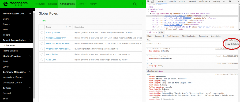
- Click on the New Style Rule option (circled above) and name the new style :root
- Start adding variables to :root selector. Note that if the
<html>element is selected in the Elements panel, then you should have full autocomplete of available vars.
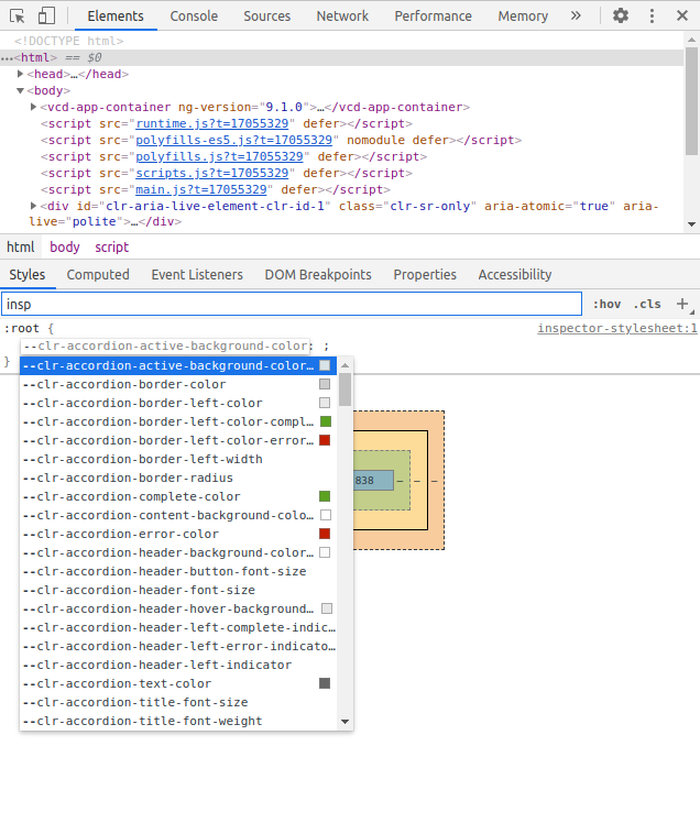
Any variables you change here update immediately in the portal, without changing the theme for anyone else. This is an easy way to confidence check your theme choices without the full upload process and without affecting other users.
Summary
Building a custom theme in VMware Cloud Director has never been simpler. This allows providers to put their own brand front and center for their tenants. The current approach offers substantial benefits toward managing themes, including:
- small, targeted theme definitions
- better forward compatibility
- no more need for intermediate generation step
- as much (or as little) overriding as you need
- live preview via browser
This theme approach is already available in 10.2 and in the 10.0.0.3 patch release. Look for it to be available in an upcoming 9.7 and 10.1 patch release as well.
Questions? Kudos? Or do you just want to share an awesome custom theme you wrote with this new technique? Drop it in the comments section!


